|
Materials:
Paper - for final project, choose a thick parchment or other attractive paper
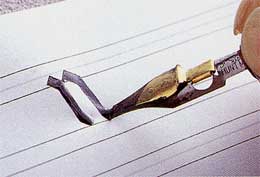
Pen - a dip pen is best (pictured right); you can also use a regular calligraphy
fountain pen with cartridges, but it is more difficult to switch between colors
Ink - bottled for a dip pen, cartridges for a fountain pen
Quick Tips:
Always pad your paper - never practice calligraphy on a single sheet of paper
on a hard surface. Use several sheets of paper as padding, and ideally prop up your working surface at a 30 degree angle
to your tabletop. You will be able to write more easily for longer periods of time.
Plan out your calligraphy - write it out first, and line your paper, don't
write freehand. Even if you are writing on a curve, draw the curve in pencil first.
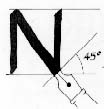
Hold the pen so that it rests on your first knuckle rather than sliding down
to rest along your thumb. This will give you more control. Do not over-dip. Dip the pen in the ink so that
half or 2/3 of the nib covered, and keep dipping every few letters. Unlike a regular pen, a calligraphy pen is typically
held at a 45 degree angle to the paper, and the flat tip is at a 45 degree angle as well - see diagram left.
|
| CLICK TO ENLARGE |
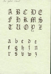
Gothic was a popular medieval calligraphy. It was also called Blackletter for the dark appearance of a written page.
The letters are square in shape, and are written at a 45 degree angle.
Click on the photo (right) for a larger image of the Gothic alphabet. Try copying
the simpler lowercase letters, then move on to the more elaborate uppercase letters. Make sure to use a 45 degree pen
angle.
Try writing your name, squeezing the letters close enough together that
you could fit just one pen stroke between them. This technique was used by monks copying manuscripts, in order to
save parchment.
|
| CLICK TO ENLARGE |
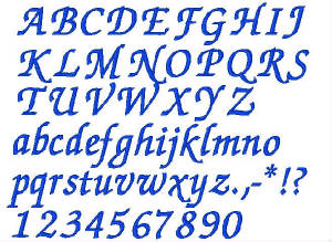
Chancery is a later, more flowing alphabet. Developed in
Italy as a method of quick, slanted 'Italic' writing, it is still used today.
Use a 30 degree angle for this alphabet. Look closely at the flourishes -- if
you are using the correct pen angle, the thin and thick areas of the strokes will look like the example on the left.
|


